Click on any image for a larger version
This exhibition had only one day to go when I was warned not to miss it. And am I glad I went. It was magnificent.
Its centrepiece was the work of Colard Mansion (1440-1484) who I'd never heard of. He was active as early as 1454 as a bookseller, scribe, translator and contractor for manuscripts. He was soon into printing with moveable type, invented by Gutenberg not long before (1439).
He became one of the most famous printers of his day and the exhibition shows examples of his work, right through from the manuscript books to the later printed versions. His progress is meticulously examined, warts and all.

There's plenty of writing on the wall to explain what's on show but this is the magic gadget that takes you through the nitty gritty of the huge number of exhibits. You just wave it at a little box at the end of a row of exhibits and it talks you through them. Marvellous gadget and brilliantly implemented.

Illustration courtesy of The British Library
You weren't allowed to take photos of the book exhibits, which is a pity as some of the examples were fascinating and the timeline showed the printer struggling with new techiques which didn't always work. So I have had to import this example of a Mansion printed book (above) from the British Library.
The printed books at this time set out to faithfully copy the manuscript versions. This meant casting type which corresponded with the hand drawn letters in the manuscripts. This was done so well that many people would later find it hard to tell the difference.
Then there were the alignments to think of - dropped capitals at the beginning of chapters and paragraphs and the miniatures which were inserted later, either hand done or printed.
Then the question of colours. Some multicoloured books were printed in a single run (which I don't understand) while others had multiple runs giving rise to the danger, and it happened, of serious misalignment and lack of adequate space.
I would love to have seen some video material on how this was dealt with as the examples in the exhibition both of what worked and what didn't were fascinating.
They did have a really excellent short video showing the designing, casting, and use of moveable type. I knew most of the using bit from having been a letterpress printer myself, but I was very impressed by the presentation.
 Death of Belisarius's Wife
François Joseph Klinsoen
Brugge 1771 1839 c.1817
Also on display were paintings by some of the Flemish masters, and, oddly enough, there was no problem with taking photos, without flash, in this section. So out came the camera from the deep recess of the trouser pocket.
This took my fancy for two reasons. There was a lot of death, and last judgement, around in the paintings and this one was quite pleasing compared to some of the others. But the single exposed breast, even on a poor dying woman, really tickled my fancy. I have recounted elsewhere how Gordon Brewster adapted a cartoon, by Louis Raemaekers which showed a similarly exposed breast, to the sensibilities of an Irish audience in the 1930s. However, in these modern and enlightened times I can happily show you the original of this one.
 Death and the Miser
Jan Provoost
Mons 1462 Brugge 1529 : c.1515-1521
Before coming to the heavy stuff in the last judgements I thought to show you this medieval version of A Christmas Carol.
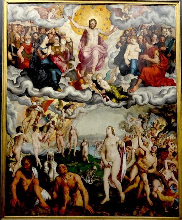
 The Last Judgement
Jan Provoost
Mons 1462 Brugge 1529 : 1525
And so to the end of the world, of which we may soon get a taste ourselves, to the Second Coming "to judge the living and the dead". It says something about the way I was brought up that I could relate to these paintings straight away. No messing - you're in, or you're out, period.
The folk in the top half are clearly already in, though I can't quite figure out if there might be a hierarchy in there. The folk in the bottom half are clearly in the course of being processed. Those on Christ's right hand are clearly on the way up, those on his left on the way down, and those in the middle still pleading their innocence of all charges.
The Last Judgement
Pieter Pourbus
Gouda (NL) 1523/4 Brugge 1584 : 1551
Here the scene is less determinate. All sorts seem to be pleading. Lucky ones are either being raised up by flying angels or getting a helping hand from cherubby angels in situ. Meanwhile the unlucky ones are being carted off to the other place by gremlins, some of them still pleading their innocence. And right in the middle a poor fellow, or is it a wan, waiting overlong for their case to be listed.
I can't make up my mind about the parted red sea of bodies in the background, seeming to run in both directions.

Map of the Zwin region
Jan de Hervy
16th Century, Bruges
Whew ! Leaving all that tumultuous and upsetting stuff behind I come upon a real thing of beauty. Unfortunately the glass mounting and the reflections don't allow me to show it to you properly.
The Zwin was a sea inlet, created after a huge storm in 1134 which turned inland Brugge into a seaport. It then rose to become one of the foremost medieval port cities of Europe. However, from the late 13th century onwards, the channel was affected by progressive silting, which ultimately caused the waterway to become unusable and cut off the harbour of Brugge from the sea.

This is a tiny detail from the map which may give you an idea of the beauty of the whole work. I have shown an extract of the city of Brugge in my post on the Jerusalemkapel which I took from the latest book published on that wonderful chapel.
No comments:
Post a Comment